A new ecommerce site where glasses complete the look.
Most eyewear sites sell frames. We wanted this one to sell the feeling of wearing them.
Our starting point was cosmetic language. Beauty brands talk about colour, finish and confidence, and glasses do the same job: they change how a face reads before anyone says a word. So the site is built around one idea: glasses complete the look.
The palette. Three colours carry the brand: berry, cream and ink blue. Together they feel rich, warm and a little bold, with enough contrast to stay legible and accessible on every screen, including mobile.
The type. A refined serif sits against a clean, modern sans. Within the serif, single words shift between roman and italic, which gives headlines a rhythm and keeps the elegance from feeling static.
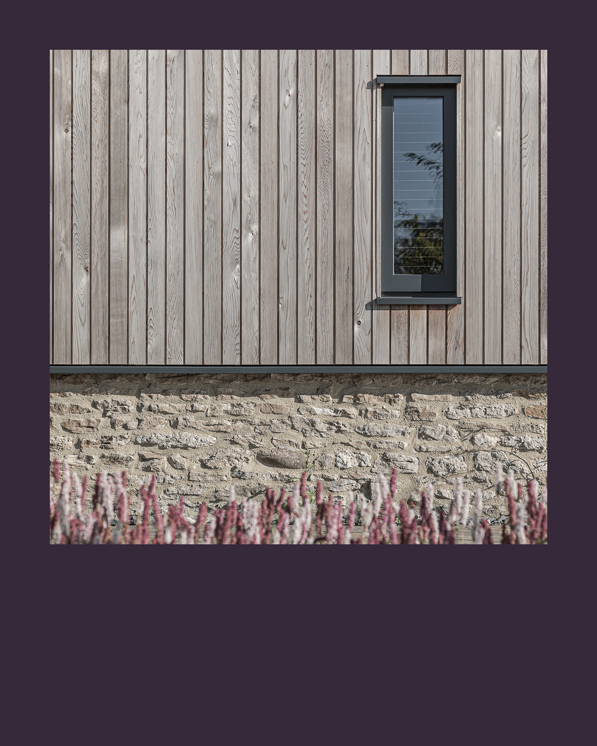
The imagery. The image in this teaser isn’t from the final site. It suggests the mood and direction of what’s to come.
The work. We handled consultancy, concept, website design, Figma prototypes and online guidelines. The design is complete and the site is launching soon, so we’ll share more once it’s live.
This is part of Studio & Screen, our weekly look at what’s on the desk, from luxury retouching to web, fashion to design.
If you have a project in mind, get in touch at imaging@naish.co.uk or call 07976 752417.